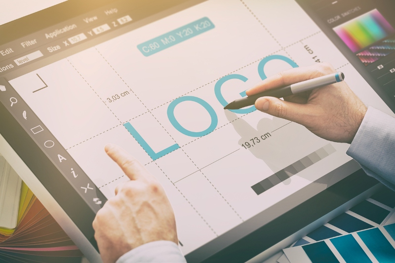
You’ve made your dreams come true and have established a company. Yet, your brand doesn’t have a meaningful logo. This is a common issue many entrepreneurs stuck with at the beginning. Logo making shouldn’t be confused with any other direction of design, as there are numerous unique aspects, which have to be taken into account. We will walk through the majority of these features in this article, but, in advance, it is to be mentioned that you can create an excellent logo yourself thanks to dozens of digital tools available online.
Whether you want to animate your icon you can easily use an online animation maker. There is no need to waste time anymore let’s start discovering the world of cool logo design.
Sketch First, then Color
At all times, you have to keep in mind that in the future, your logo may appear on different placements. Therefore, you should aim at forming concepts that will look natural and memorable in any color palette. To help you come up with a design, you can use a free logo maker to have design ideas for your logo. Certain websites, boards, and other surfaces where your logo may happen to be placed will have specific restrictions applied (for example, black and white).
Creating a flexible logo will make it more universal, allowing you to present your brand on a wider selection of platforms.
Use Coloring to Deliver the Right Message

When it comes to primary locations of your logo such as your website, corporate social network accounts, and email letterheads, choosing an appropriate color scheme is essential. The shades you use in your brand’s icon should refer to the company’s field of occupation and translate its ideas and visions.
Color psychology is another crucial point, which has to be learned before you start painting your logo. According to it, each and every color stands for a specific meaning. For example, green is the embodiment of peace and relaxation, blue — safety and trustworthiness, yellow — bright and optimistic emotions, red — strength and power.
You can check out special guides, which will quickly bring you up to speed.
Integrate the Brand’s Meaning Through Shaping
Just as it is with colors, shapes considerably influence your potential client’s reaction to your product (or service) and the company itself. Worldwide famous brands design logos so their customers instantly know which qualities they will receive on purchase. You can clearly observe this phenomenon by looking at logos of companies occupied in providing sporting equipment as, mainly, their icons implement terms of speed, joy, and movement. To achieve this perception, generally, they use abstract types of emblems, which make them really recognizable due to their out-of-this-world appearance.
First, you have to understand what kinds of emotions you want to evoke with your icon.
In case you want to project solidarity, positivity, and unity, roundish shapes are your choice. On the contrary, if you represent a law firm, for example, you should use rectangles or triangles as they encompass trust, stability, and reliability.
Nevertheless, logos can be of any possible shape and form. Hence, take your time and spend an evening or two searching for various examples throughout the Web.
Remember the Main Principles of Logo Design

Professionals in the design industry guide themselves by a set of generally accepted principles. These are time-tested rules, which allow their holders to produce the best logos and designs the modern market knows. Basically, enthusiasts are committed to the following 6 specifics:
- Simplicity
- Originality
- Versatility
- Scalability
- Balance and proportion
- Timelessness
This array is some sort of an exam. Therefore, your emblem has to pass each stage of it to prove its excellence and eligibility. For example, it would be a sign of bad taste for your logo design not being able to be scaled as it might be placed on everything, beginning with a cup or pen to a huge building. In this case, designers often create several logos somewhat differing in size but delivering one single message.
It was just one example of a problem. Hence, don’t neglect to learn more about these principles.
Learn from Others’ Mistakes
The world knows many cases when a terrible design or market positioning led great companies to failure. While such situations keep occurring each year, they also provide you with a huge list of warnings, examining which you can prevent your business from collapsing.
Among the most recent design flaws, we can suggest logos oversaturated with colors, incorrect selection of fonts, imbalanced emblems with proportion issues, and others. Avoiding them will lead you one step closer to a better outcome.
Conclusions
As you can see, knowing a little about colors, forms, and rules of design can help you create a pretty decent icon yourself. Of course, it won’t replace hiring a professional for your project, but, at least, you’ll establish better communication with him or her.


