Ever wonder why you feel fresh, happy, and vibrant in a yellow room? Or why old mahogany furniture in a deep maroon office suggests a simmering, attentive, warm feeling? That’s because color plays a role in our psychological moods. Color psychology is the study of color and how it affects our behavior. The scientists, who study the power of color, know that even what we purchase at a store can be determined by how color affects our moods. Even more so the colors we surround ourselves with in our homes.
So when it comes to decorating your nest, think carefully about how colors make you feel. This deliberation will go a long way in helping you determine paint color, curtains, and the look of objects you place in each room.
Green walls and Accent pieces:
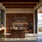
It’s no wonder that color experts say that green is calming for the mind. Most of the time, people have been escaping to green pastures and woods to ease their stress and anxieties. Green does just that to the brain and mood. It is soothing and considered the most restful color for the eye. Green could be used for really any room in your house because it promotes peace and happiness. Even in the bedroom, green is excellent for your walls. It is said to be a color that supports fertility. And if you have a home office, consider decorating it in green hues that are mind-cleansing and promote mental and emotional composure.
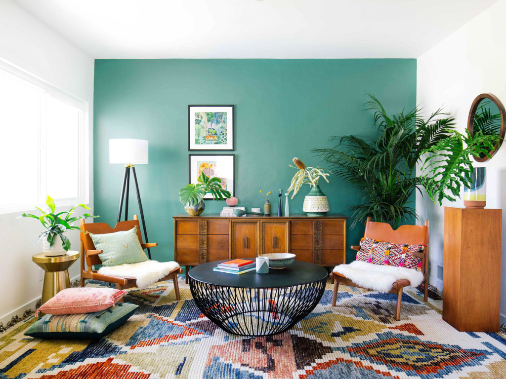
Paired with blues, green can give your guests and loved ones a feeling of well-being, as though they are sitting in a green pasture by a rippling brook.
Sunny Yellow:
It’s no surprise that in color, psychology yellow means sunshine and optimism. It would follow too that yellow is also the color used in the IKEA logo and many of their color palettes. People buying a home or furnishing a home for the first time have a happy, hopeful, and optimistic view about it. Therefore furnishing that includes the color yellow is appealing. Interior designers often suggest yellow for kitchen décor or a bathroom. That classic lemon yellow indeed connotes cleanliness and bright, happy feelings. You can’t go wrong with a cheery made to measure curtains to will lift the spirits of all who enter your home.
Red For Appetite:
Red is an intense color. In Chinese culture, it is the color of luck and fortune. Red is not subtle, and putting it on your walls means you’re going for a strong first impression of strength. It’s believed that the color red really can stir people’s excitement levels, which makes it great for stimulating conversation in a dining room. It’s best to use red on your living or dining room walls or maybe in the front foyer. It’s long known that red will also stir people’s appetites, which is why you often see the color used in décor at restaurants.
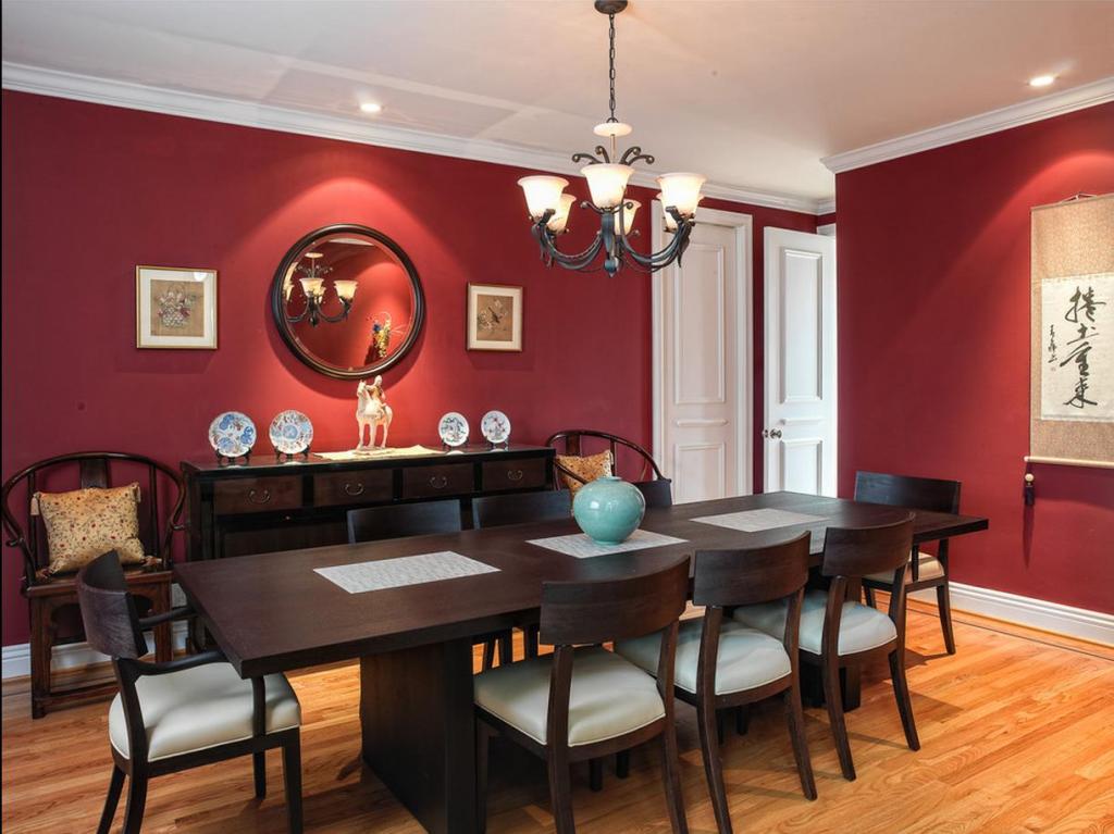
But some studies say that the color red raises blood pressure and speed respiration, so best not to use it on the walls in your bedroom where you want to promote relaxation.
Enthusiastic Orange:
If you’ve ever looked carefully at the logos designed for children, they often use bright orange. That’s because, in color psychology, orange represents creativity, enthusiasm, and adventure. It’s not a dominant color like red, but it inevitably catches the eye in a bright, attractive way. If you want to add some real-life into your décor, consider carefully selection objects that use the color orange. Orange looks great in a child’s bedroom or even in small amounts in a den. Best not to use too much orange, but done sparingly it can liven up a room.
Pretty in Pink:
Pink provides the neutrality of white with just a touch of the intensity of red and stirs them together to create a color that is soft and feminine and warm. It’s a traditional color for a little girl’s bedroom that will elicit squeals of happiness and joy. Toy designers know pink is a playful color and will draw the eye of young girls. Remember, however, that as girls grow up, they tend to age out of an all-pink bedroom. Better to use pink pieces to accent a girl’s room, such as lamps, curtains, wall hangings, or shelves.
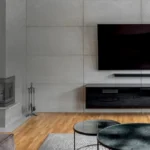
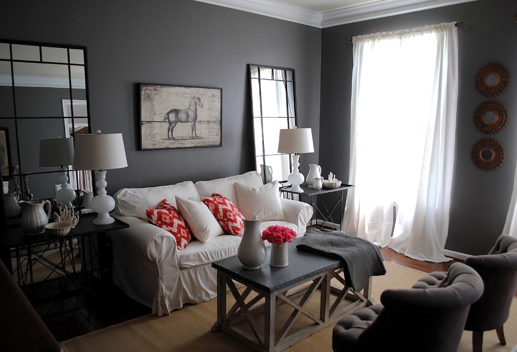
Grey:
One of the most popular shades of paint right now is called “Agreeable Grey,” and there’s a reason it’s so agreeable. Grey makes a home look and feels sophisticated and modern without being overly pretentious. It’s a great color because it can be used seamlessly throughout the whole house and still make a great look in every room. In color psychology, grey is the one that stands for peace and balance. Even though people equate grey with rain clouds and drear, in your walls, it won’t give this same effect. It’s a soothing backdrop for great art or photographs on your wall. Green plants look stunning up against grey. And it immediately gives your home a contemporary feeling. If you want to walk in your home and have it feel modern, restful, and always relevant, grey is a great color. You can read more details about agreeable grey details in more depth.
Purple:
Purple isn’t exactly a color you often see on the walls of people’s homes, especially if it’s a dark, dramatic purple. Deep purple tones used to represent royalty and nobility. Kings and queens crowns were inlaid with deep, luxurious purple velvet to evoke in subjects respect for authority. But in lighter tones of lavender, purple is very different to the psyche. Bright tones give the same restful quality as does blue, making lilac and lavender shades very lovely in the bedroom.
No matter what your personality or design style radiates, there are nearly endless color patterns and shades out there to brighten, enliven, or update the look of your house. With a little help from some research or an expert in curtains, paint, or home décor, you can have the home of your dreams and a feeling of peace and goodwill in every room.